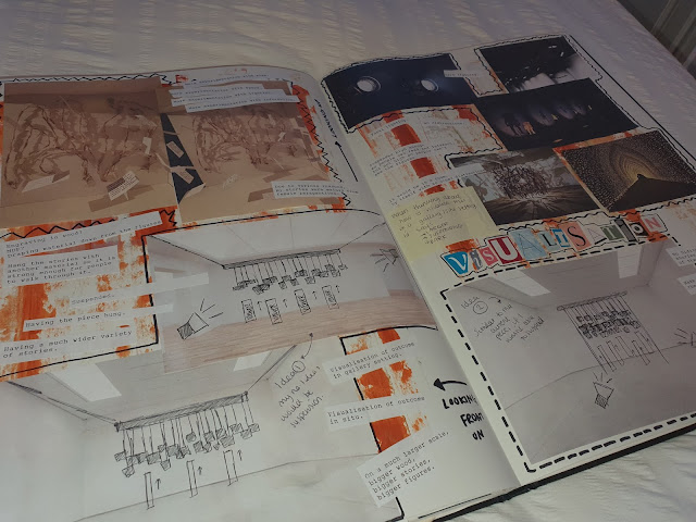
To move on from my initial designs, I decided to create some backgrounds to start with. I used paint with paintbrushes and tissues! I wanted to create a sense of chaos with my wallpapers as this is how my OCD makes me feel - one minute I feel stable, the next I feel really on edge and panicked. This sense of unpredictability with the intrusive thoughts, when and where they are going to 'jump up on you'. Through this project, I have found other people suffer with this too.
After applying the base paint, I then worked back into them with mark-making I have looked at and created as a response to this project. I used black ink to do this as I feel it stands out the most, contrasting with the colours. They are quite bright whereas the black is very dull and 'depressing' - possibly representing the 'mood swings' I also suffer with due to my OCD.
Here are the final outcomes from trying the paint:
This one here was a pattern I had drew a little while back in the 'Reconstruction' workshop from sunglasses. I found it really represented OCD at the time and visually is really appealing. These very 'neat', organised shapes then layed on top of a very 'crazy' background - contrast! I chose these colours to incorporate the 'traffic lights' phrase I had got in an interview. I felt I connected with that so merging all this together seemed the best idea.

I had some left over paint on a tissue so I just went with the flow with how my OCD makes me feel and used it to make this background. I feel that is what I am doing with these designs - putting my OCD into a creative way to try and connect with other people who suffer from it, as well as giving an insight on what it's like to have it. This pattern with the squares is from the 'Free Writing' workshop where someone described the intrusive thoughts as 'swelling up' - having the squares placed like this represents the one thought leading on to another and another.

This one here. I chose a blue to add some 'calm' to these designs. For me, blue is a very calming colour. I actually redecorated my room, just before COVID to make a space I could relax and work in as I knew I would be spending a lot of time at home. I chose blue for the colour scheme as I feel it really 'chills me out' when I am feeling anxious. The pattern here is from my knitting workshop - I created a piece where these lines intersected, like the drawing above. Again, as all of these are, I felt it helped portray my OCD in a visual way.

This design here is from a recent page of drawing, in response to the TED talk 'Steal Like An Artist'. A piece of paper I had cut off generated this line drawing and I felt it really showed the highs and lows I experience due to the disorder. I then paired this with a red wash of paint - a lot of people had mentioned this colour as I was interviewing and talking. I myself, when in an 'episode', do relate to this colour. You feel so powerless and weak letting those thoughts consume you - red linking to this anger and frustration.
This one here is more recent too. A word I mentioned was 'jelly'. My mind feels so 'messy' and feels like it has 'no structure' - in response I created this pattern. I then again used the red, amber and green for this 'traffic light' colour scheme,
The colours here are also for the 'traffic light' phrase but I had no plan as to what I was going to do. I picked up the paint and placed it where I felt I should. I ended up with a very crowded design which I really love!
This was a design that didn't quite go to plan. The pattern was recent as well, in response to the TED talk previously mentioned. The white pen I was using actually broke so I couldn't continue it on. I feel the end product would have looked really effective. I have photographed it to see if I can do anything with my segment above.
I feel like these are all really successful in showing what I wanted and as designs, are really intriguing, posing so many questions.


